
End-to-end ios mobile appChatful: AI Chat Buddy
Creating Chatful, a conversation-focused Mandarin learning app that uses AI to help heritage learners build fluency with on-demand support and engaging practice tools
Role
Sole Designer
Timeline
4 weeks
Skills
Research
Ideation & Sketching
Wireframing
Prototyping
User Testing
Visual Design
Tools
Figma
AI Tools (custom GPT, Builder.io, Readdy)
Jump to Section | Prefer a PDF? Request the slide deck
The Problem | The Solution | Conducting Research | Defining the Opportunity | Developing a Solution | Prototyping | Testing & Revisions | Final Prototype | Takeaways
The ProblemThere Are Limited Opportunities to Practice Chinese
Mandarin Chinese is the second-most spoken language in the world. It is also one of the most difficult for native English speakers to learn.
Heritage learners grew up learning the language from family members at home and therefore have varying levels of proficiency.
They get frustrated when they try to speak in Mandarin to native Chinese speakers but are unable to think of the right words to fully express their thoughts.
As a result, they often switch back to English or abandon the conversation entirely.
Existing solutions follow HSK/CEFR leveling but don't adapt to a heritage learner's individual needs or offer on-demand support, so they end up losing the confidence to keep practicing Chinese.
Go from Chinglish to ChatfulThe Solution: Bilingual AI Voice-Based Chat Buddy
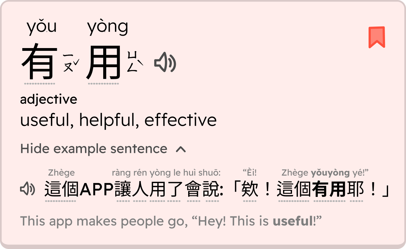
Learn and bookmark new words during your AI chat
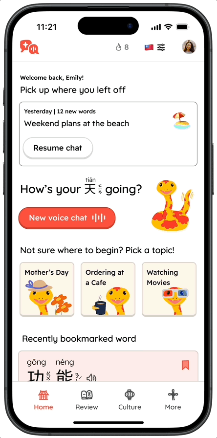
Review what you learned in previous conversations
…And more, with Chatful!
Chatful is an AI voice-based chat app that creates a highly adaptive and low-stress environment for users to naturally improve their speaking and listening skills.
By blending Mandarin Chinese and English (Chinglish) and focusing on new words and concepts, Chatful helps users learn through exposure and repetition.
Users can also review what they’ve learned with games and on-demand AI support.
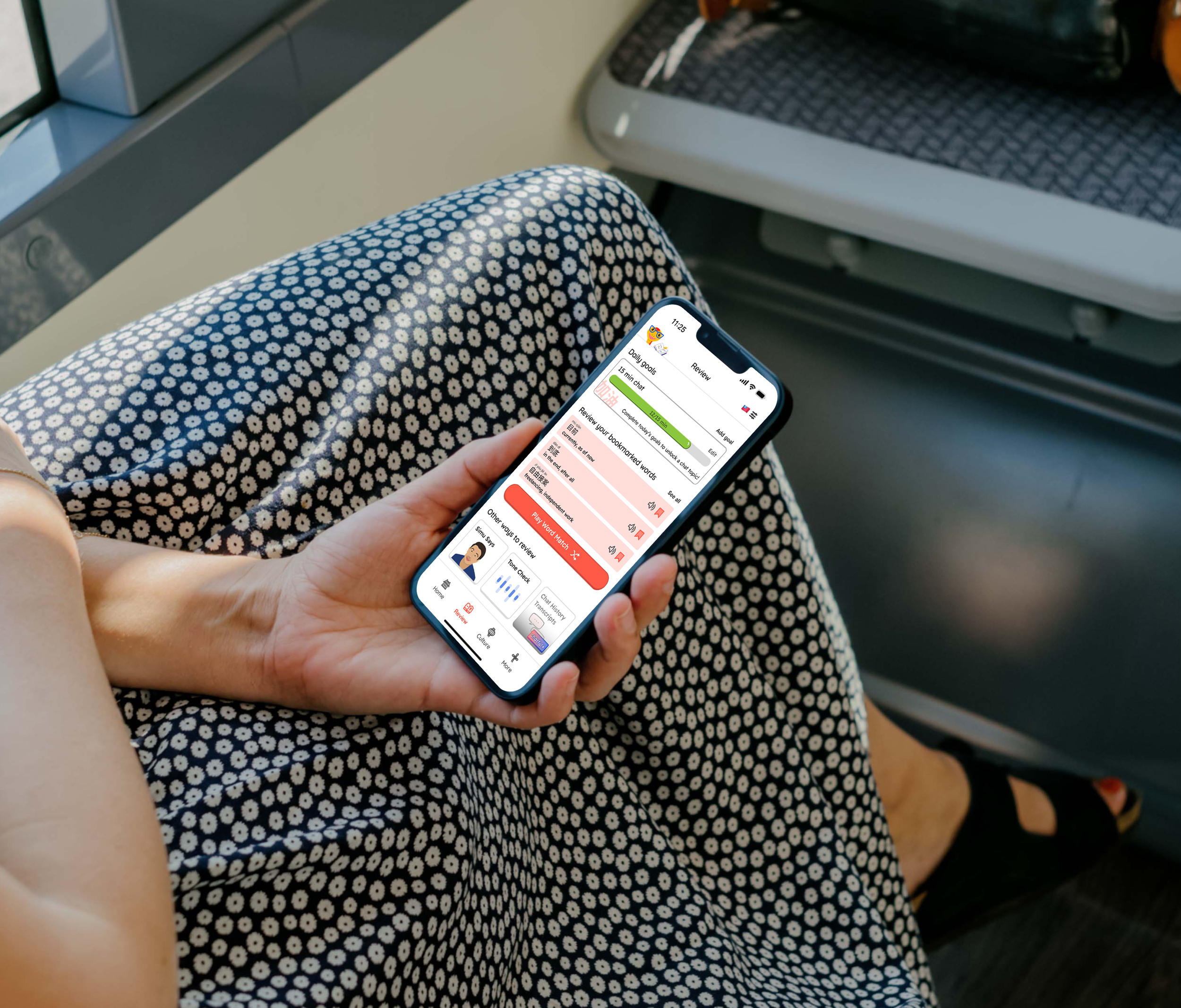
Key screens from the Chatful app. Emphasis of the MVP was on how to best learn new words from AI chat conversations.
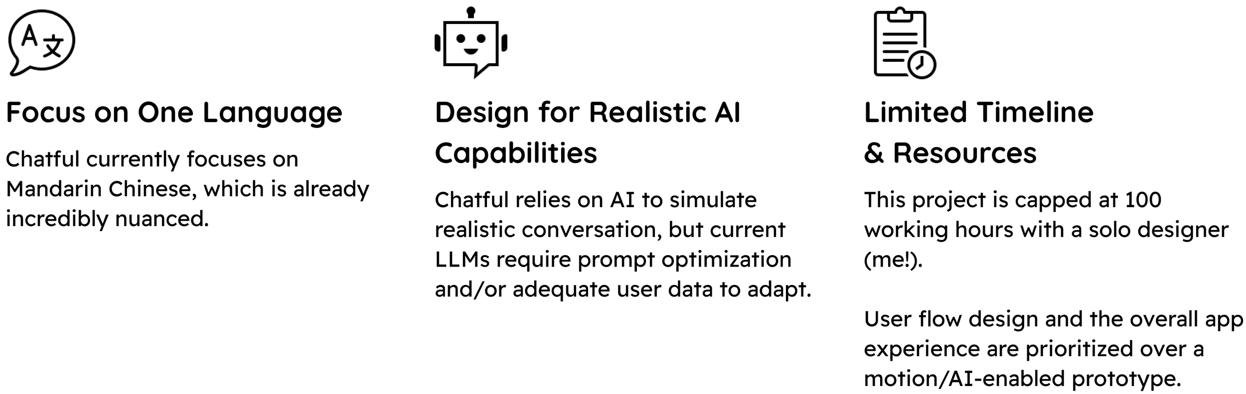
Project Constraints
A full end-to-end app would get complicated quickly if too many features were built out at once, so there were several constraints placed at the start of the project to keep the scope in check and deliver the best user experience:
Gathering key informationConducting Research
Finding a Market Gap with Traditional Chinese Support
To better address our problem, competitive analysis and user interviews were conducted. Competitive analysis was completed to understand what the best AI language learning tools for conversation were doing, and where Chatful could identify a gap in the market. If a product is supposed to be “smart” with artificial intelligence, it should be able to adapt to a wide range of needs. I found that many of the existing apps offered support for speaking with people in mainland China, but not much else in terms of regional differences or even offering traditional Chinese characters.
Opportunities to Stand Out
Features that support non-mainland Chinese and secondary skills like reading/writing
Zhuyin phonetics or traditional characters
Regional vernacular differences (some phrases are more popular in China vs. Taiwan, or even have different ways to pronounce them)
English/Chinese (Chinglish) to bridge gaps in proficiency
Ways to review the chat history with transcripts to learn phrases or practice reading
User Research: Users Want to Connect with Culture and Improve Listening Comprehension
Six participants were interviewed regarding their experience growing up learning and speaking Mandarin Chinese. Participants were of all genders, in their early to mid 30s, lived in major metropolitan areas, and their immediate families immigrated from either China or Taiwan.
Users were asked about how they learned Chinese, how often and in what situations they currently speak/practice Chinese, what their learning styles were, and what motivations and pain points they had.
New Insights
86% of users felt that listening was a more important skill than speaking
None of the users interviewed had a desire to learn a second language, and felt only Chinese was important to know because it was their heritage language
Users primarily wanted to connect with the culture just for themselves, not necessarily to pass on for future generations
Users who were born in the US had more guilt and self-inflicted pressure of fixing their broken Chinese, whereas users who immigrated at a very young age felt no negative feelings around wanting to improve their Chinese
Our Motivated Learner, Emily!
The existing tools for learning don’t fit our main persona’s needs of learning Taiwanese Mandarin, and oftentimes they teach words that aren’t relevant to her life. She’s not going for technical working proficiency, she just wants to be able to talk conversationally with family and native speakers.

Defining the opportunityHow Might We…
help Mandarin heritage learners improve their listening and speaking skills in a low-pressure environment where they can practice at their current level of proficiency?
converging, diverging, convergingDeveloping a Solution
The idea for this app came from using the Voice mode on ChatGPT while I was practicing my conversational Mandarin out loud. I wanted to develop an app interface that would incorporate this to speak at user’s level and slowly level up the conversation in a supportive way that would encourage the user to speak freely, make mistakes, and practice new words and concepts they learned.
The mission for the product was to bring as much value to the user as possible without trying to do too much. I decided on the following areas of focus for product features.
Mapping Out the App and User Flow to Prioritize Learning
I used Octopus.do to create a map of the app structure, and I found it very helpful to see a low-fi wireframe of what each screen might look like. Each main section/navigation tab of the app (Chat History, My Vocab, More section) would provide an opportunity for the user to review what they had learned in the Chat, and they could modify their goals in their Profile. The user flow of the voice chat was prioritized as it was the main feature of the app.
Planning out the entire app, including screens not built out, ensured the user getting value throughout the app.
The user flow: A user learns new vocabulary in the chat, and then reviews the transcript after the chat has ended. Here, a user can expand upon any word and open up a dictionary type page.
Hand sketched screens allowed for quick testing and feedback.
Low-Fi Feedback Highlighted Opportunities to Improve User Experience
-
I received feedback that seeing a big section on the Home page regarding their progress could be demotivating. Some users said they already felt guilt about not practicing enough, that seeing their lack of progress would make them feel worse. Instead, they would rather be called to take action in a bite-sized way, to get them started.
-
There were mixed reviews on whether an entire section dedicated to past transcripts would be helpful. Some users said they would probably never look at that section, and some users said it would be nice to have access to as reference.
-
The chat feature seemed great, but everything else seemed pretty standard, like a long vocab list or dictionary. Why should AI features start and stop with the chat function? The app should bring insights to the users by identifying areas for improvement — be it grammar, pronunciation, or the same tricky vocabulary — and automatically targeting them for practice. Users also wanted the app to just provide more support. They didn’t always need a direct translation. Instead, they’d want to know cultural context or nuances between very similar words and when to use them.
Making Improvements Before Building Hi-Fi Wireframes
Incorporating user feedback, I made the following changes:
Combine the Vocab and History (Chat Transcripts) sections together into one: Review
Center the Home screen on future chats and conversations and active learning, and center the Review section around going over learned content, practicing, and seeing progress
Incorporate games, pronunciation support, similar words, and cultural context into the core areas of the app, rather than hiding them in the More section.
Prioritizing Features
Now that I had a direction to go in, I put all possible features on an effort/impact matrix. Effort was defined as a balance of effort both on the design and (assumed) engineering efforts, and impact was defined as the impact to the user experience. Mapping the features on the matrix allowed me to assessed which features needed to be prioritized for this first MVP. The features are color coded to show what was essential vs. what could be completed later, in green and yellow, respectively.
I also bucketed them into separate categories based on app function to serve as a checklist for myself as I built out the screens in higher fidelity.
Challenges
Challenge #1: Reducing Fatigue for the User
How do I make a chat-based app with translations and transcripts without overwhelming the user with on-screen text?
Use animations, graphics, and familiar UI patterns and elements
Hide information until it becomes relevant for the user
Challenge #2: Balancing Speaking/Listening with the Varying Reading Levels
How do I address gaps in reading ability and support users at all reading levels?
Provide audio when possible when Chinese is on screen, and provide pinyin to supplement the audio
Show the English translation where Chinese is shown
Visual Design & BrandingCreating an Educational & Friendly Brand
Tone of Voice: Educational and Fun
I wanted users to feel an emotional connection to this app, since user research uncovered how strong cultural connection was for motivating a user to learn. It was important for the app to feel fun and educational without feeing too youthful or boring.
Design inspiration came from colorful and engaging apps:
Duolingo, gamified language learning
Tolan, AI chat buddy
Color Palette: Red, Gold, Blue
The color palette brought life and personality to the app. I tested out several palettes but ultimately chose the following:
Orange-Red and Gold: Bright and bold colors that are seen as lucky in Chinese culture
Blue: A darker valued color that also helps balance the warm tones of the primary/secondary color
Slight variations of the color made a huge shift in tone: darker blues felt more professional, mature, and corporate. A very bright yellow would likely create challenges in meeting contrast standards for WCAG accessibility and may not end up being used often in the app.
Name: Chatful
With the name of the app, I wanted it to be language agnostic. The MVP would only focus on Mandarin Chinese, but the name Chatful would convey the core functionality of the product (chatting) and the feeling of abundance and positive opportunities.
PrototypingBuilding Out the Chatful App
The flow of the prototype can be broken down into 3 main tasks:
Task #1: Chat with the AI
Task #2: Learn a new word in the chat
Task #3: Review the word after the chat was over
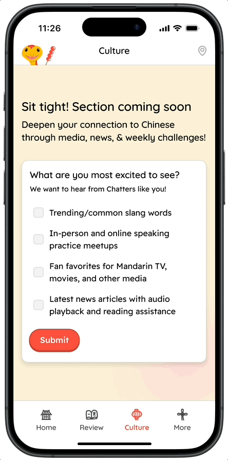
While it would not be part of the main task flow, I also designed other areas of the app such as the Culture section and the More section. These sections would not be fully built up but post-launch, I would track user engagement to gauge interest and help prioritize what part of the app to build out next.
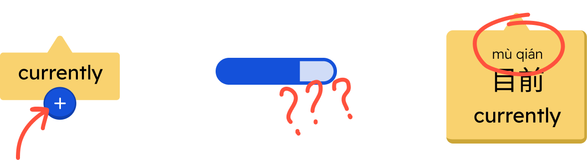
Incorporating User-Configured Settings Due to AI Limitations
When a user starts using Chatful (and at any point while using the app), they will have the opportunity to configure a few things for the best experience. As mentioned in the constraints, AI is currently not perfect and requires user input to give it somewhere to start. Users will set:
Their preferred AI voice style
Their regional preference (for accents, vernacular, and assumed written properties)
Their preferred written characters (traditional or simplified) and pronunciation guides (zhuyin and/or pinyin)
This level of nuance is missing from competitor apps, and users are able to get the support they need while learning the regional Mandarin most relevant to them.
Unique Feature Built Out: Spotlighting
In Chatful, a user is able to Spotlight new vocab by clicking on it in the chat. When a word is Spotlighted, the AI will focus on and use that word more often in their chat session to help the user learn through repetition. This mimics the natural way users learned the language growing up at home, with family members repeating words and common topics.
Interacting With Saved Vocabulary After Chats
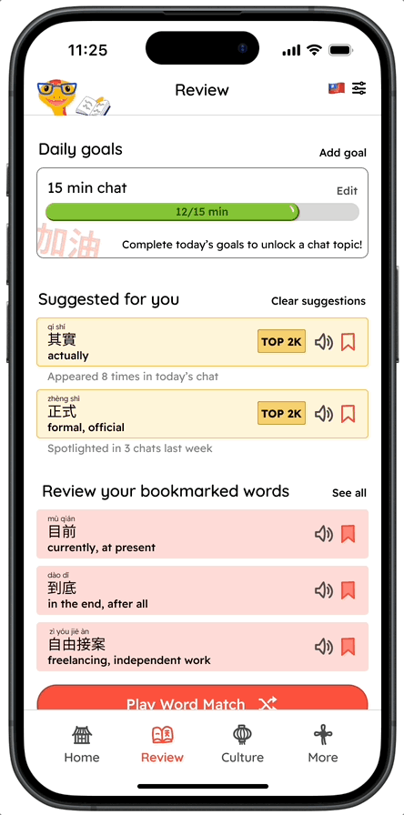
To review learned words, users can go into the Review section and play practice games or open up dictionary pages for the words they’ve learned. Giving users multiple contexts to review learned vocabulary will help strengthen their memory.
Each vocab word has a global frequency bar showing how common the word is in spoken Chinese. If a word is very common, a TOP 2K badge will be shown, so a user knows it is a very common word they “should know” to help increase fluency.
Prioritizing Core User Experience Over a Visually Advanced Prototype
For the prototype itself, I used Figma to connect the high fidelity wireframes with touchpoints and limited animation. I wanted just enough to demonstrate how the app might behave but did not spend additional time on any motion design that would certainly be delightful, but not essential to the MVP and fit within project scope.
Chatful Key Screens: Chat, Learn, Review
Testing & RevisionsGetting Chatful in the Hands of Users
User Testing Metrics Exposed Areas for Usability Improvements
100% of users were able to complete the tasks and get to the end goal screen, however when asked follow up questions about their understanding of new concepts, that’s where the cracks were showing. There were many opportunities to make the app more intuitive and helpful.
Evaluating Each Feature’s Usability to Identify Interruptions to Task Flow
Another way to view the usability of the prototype is to break it down by feature. Tester #4 had to leave the test early, and was able to complete the core user flow (and 3 task flows) but could not stay for the follow up discussion to go over all of the features in the app.
Interruption #1: AI Features Were Not Prominent Enough in the App
Although all users were able to complete the task flows, the table helps show the success and usability of each feature. Users were able to understand the pinyin, but would have preferred to see it throughout the app to be fully useful. For the dictionary entry, users felt it was not “smart” enough to provide as much value as the AI chat.
Interruption #2: The Word Frequency Bar Was Not Bringing Value
Almost all users struggled to understand what the word frequency bar meant, most thought it was some form of progress, but all users agreed that while it’s helpful to know what’s commonly spoken, what they really cared about was what would be commonly spoken for them and the contexts they care about.
Final Revisions Driven by First Principles
Conducting testing on the high-fidelity prototype was extremely valuable as it highlighted key issues of the product usability. I wanted to understand how to improve the product experience for not just areas that failed the success metric, but for the entire app and for all users.
The answer was in going back to first principles:
Ultimately, users just want to understand what they don’t know.
This was the main motivation to use the app (learn Chinese words and gain confidence speaking them), and it applies to how they interact with each part of the app itself.
Major revisions are shown below.
Before & After: Reducing Confusion of Voice Chat UI Functionality
Before & After: Reducing Taps to Minimize Time to Value
Before & After: Making the App Smarter For Each User
Assumed Impact & Results
A second round of testing was not conducted after revisions due to project scope constraints, but the usability is expected to increase due to the changes made:
Features that were useful were increased throughout the app
Confusing UI elements were either removed or labeled
Simple volume-off use case was supported
These revisions targeted the biggest task (encountering new words in the Chat) and improve all 8 of the core features.
With all of these incorporated, the final prototype is shown below. All task flows are combined within one prototype — try it out for yourself!
A Look back on the JourneyTakeaways & Next Steps
Reflections
What Went Well
Users liked the concept of practicing Mandarin + English in an AI chat with new words being repeated in various contexts using the Spotlight feature.
Users also found the prototype easily navigable with context in expected places.
I felt deeply connected to this app, and I am extremely proud of what I’ve built (from the functionality to the visual design and branding) as well as the potential impact
What I Learned
Utilize AI when possible to provide more personalization. The app should learn what the user wants/needs and do it automatically.
Don’t focus on feature parity to other competitors if those features aren’t actually useful or if they require superuser level familiarity to understand.
Support “volume off” and loud/public setting use cases. Though they are not the core use cases, the UX may be unpleasant without this functionality.
Next Steps
Validate Changes
I would conduct another round of usability testing to validate the changes made. The success metrics would be adjusted to capture not just a binary pass/fail of task completion but measure quantitatively how well the task was completed.
Evaluate Additional Features
With more time, I would look into implementing the following features:
Test auto-Spotlight edge cases
Compare how a set limit vs. limitless number of Spotlight words affects long term learningIncorporate a social element
Incorporate friend streaks and build various Community offerings, and increase the user base with in-app incentivesAdd tagging feature to words
People care about words relevant to them more than global frequency, so allow them to create custom tags and start chats focused on tagged groups
Bonus: Create a functional prototype that uses AI (likely with vibe-coding)
Now that the UX has been designed and tested, I would love to build out a functional AI prototype and get a LLM or custom GPT incorporated. With a fully functioning prototype, I would be able to gather how people would actually interact with the AI when given free reign and how they would use the app to learn.
Post-Launch Data
After the Chatful product launch, aside from tracking daily/weekly average users, I would want to collect data regarding the following to improve the user experience:
Thanks for perusing!
If you’ve made it this far, I appreciate the time you spent reading this case study. I also wrote a blog post detailing my experience using AI tools for part of my process with the Chatful project. I’m super passionate about this project and would be delighted to talk more about it.
If you like what you saw, send me an email and let’s talk about working together to make this a reality!
(If you didn’t, you can still send me an email because I appreciate getting all feedback.)
